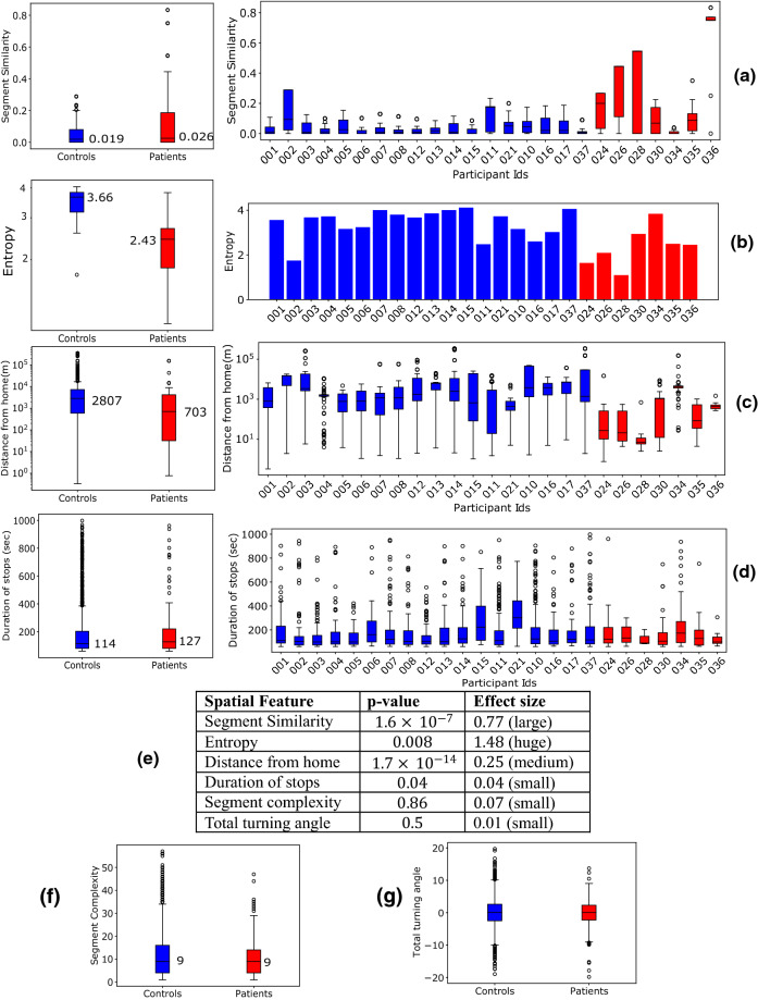
Figure 3.
(a–d) Aggregate (left) and individual (right) distributions of feature values between control and patients. (a–c) are the features that produce best classification in Fig. 4. The boxes represent the region between 25 and 75 percentiles while the solid line inside the box denotes the median. All other values are shown as scatter points. (e) p-values (using KS-test) and effect size (Cohen’s d) between control and patients’ alone segments (f,g) Aggregate distributions for home distances and segment complexity.

