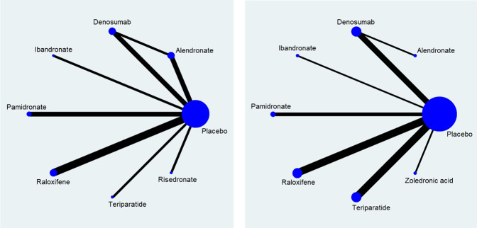
FIGURE 3.
Network of direct comparison for the treatment of Osteoporosis. Each node represents one treatment. The size of the node is proportional to the number of participants randomized to that treatment. The edges represent direct comparisons, and the width of the edge is proportional to the number of trials. (A) map for risk of fracture; (B) map for percentage change of bone mineral density.

