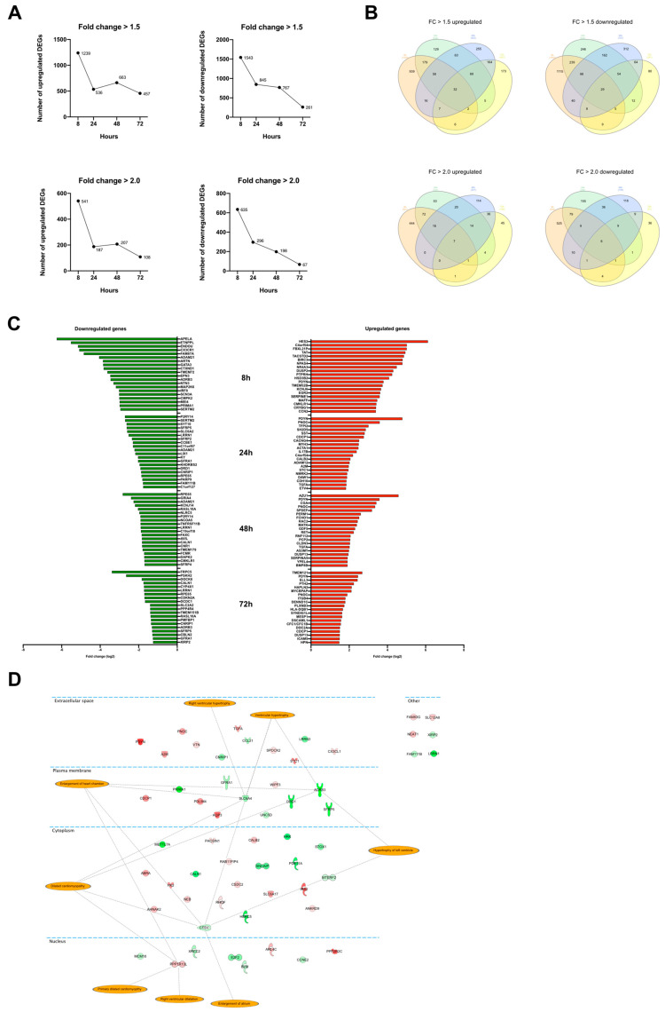
Figure 1.
Differential expression analysis. (A) Graphs showing the number of DEGs at the different time points. Top row shows the number of DEGs with fold change >1.5. The two diagrams below show the number of DEGs with fold change >2.0. The y-axis shows the number of genes, and the x-axis, the time point. (B) Venn diagram illustrating the overlap of DEGs between the time points. (C) Bar plot showing the top 20 most up-and downregulated genes at 8, 24, 48, and 72 h. (D) Differentially expressed genes that were overlapping between all four time points. The orange highlights represent terms associated with the annotation ‘Enlargement of heart’ in the IPA’s knowledge database.

