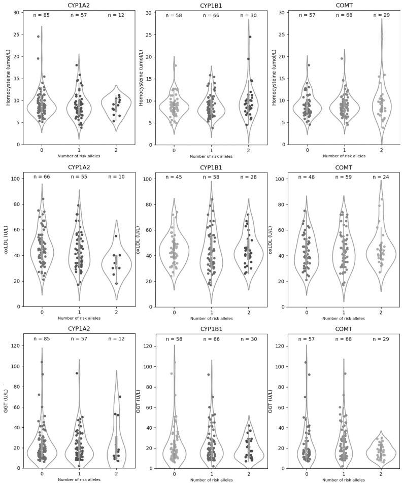
Figure 1.
Distribution of homocysteine, oxLDL, and GGT values by genotype. The violin plots show the density plot and statistical summary of homocysteine, oxLDL, and GGT values for each genotype of the CYP1A1, CYP1B2, and COMT genes. The white dot of the box depicts the median, the thick gray bar in the center represents the interquartile range (IQR), which indicates the spread of the middle half of the distribution, and the thin line extending from the gray bar represents the rest of the distribution lying between the ±1.5× IQR range. The points represent the actual distribution of individual data. On each side of the gray line is a smoothed estimation of probabilities for new points, calculated using the Kernel Density Estimation, showing the distribution shape of the data. Wider sections of the violin plot represent a higher probability that members of the population will have the given value; the skinnier sections represent a lower probability.

