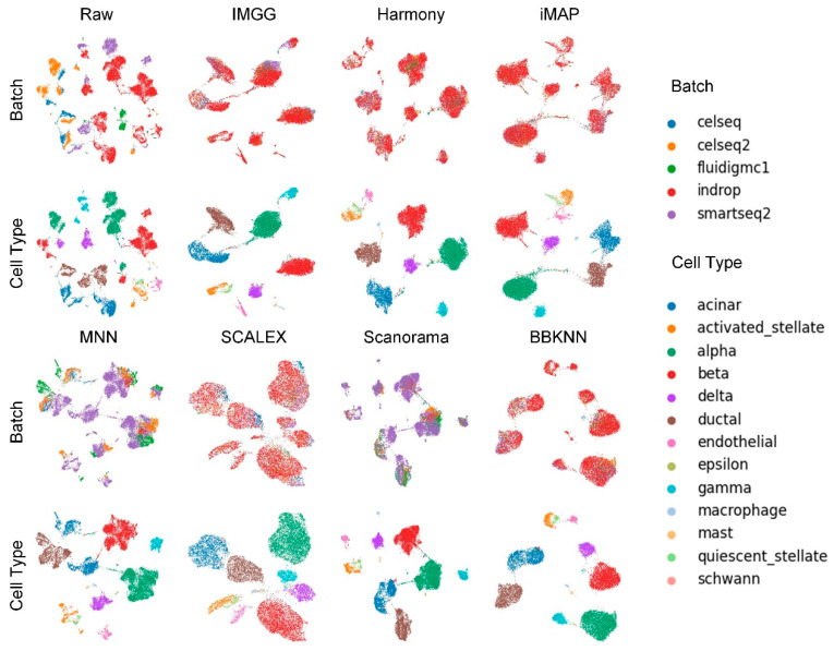
Figure 4.
Qualitative evaluation of 7 batch-effect correction methods using UMAP visualization for Pancreas dataset. The UMAP diagrams of raw data, IMGG, Harmony, and iMAP are plotted in the top half, and the UMAP diagrams of MNN, SCALEX, Scanorama, and BBKNN are plotted in the bottom half. Each half contains two rows of UMAP plots. In the first row, cells are colored by batch, and in the second by cell type.

