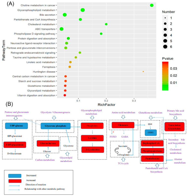
Figure 9.
The top 20 enriched pathways and the X-axis was the rich factor that was the ratio of significantly different number of metabolites to the total number of metabolites in this pathway; the larger the black circle, the higher the number of significantly different metabolites in the pathway. The Y-axis was the name of the metabolic pathway; the color from red to green indicates that the p-value decreases successively (A). The schematic diagram of the relationship between metabolites and potential metabolic pathways is (B).

