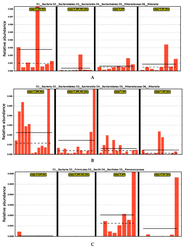
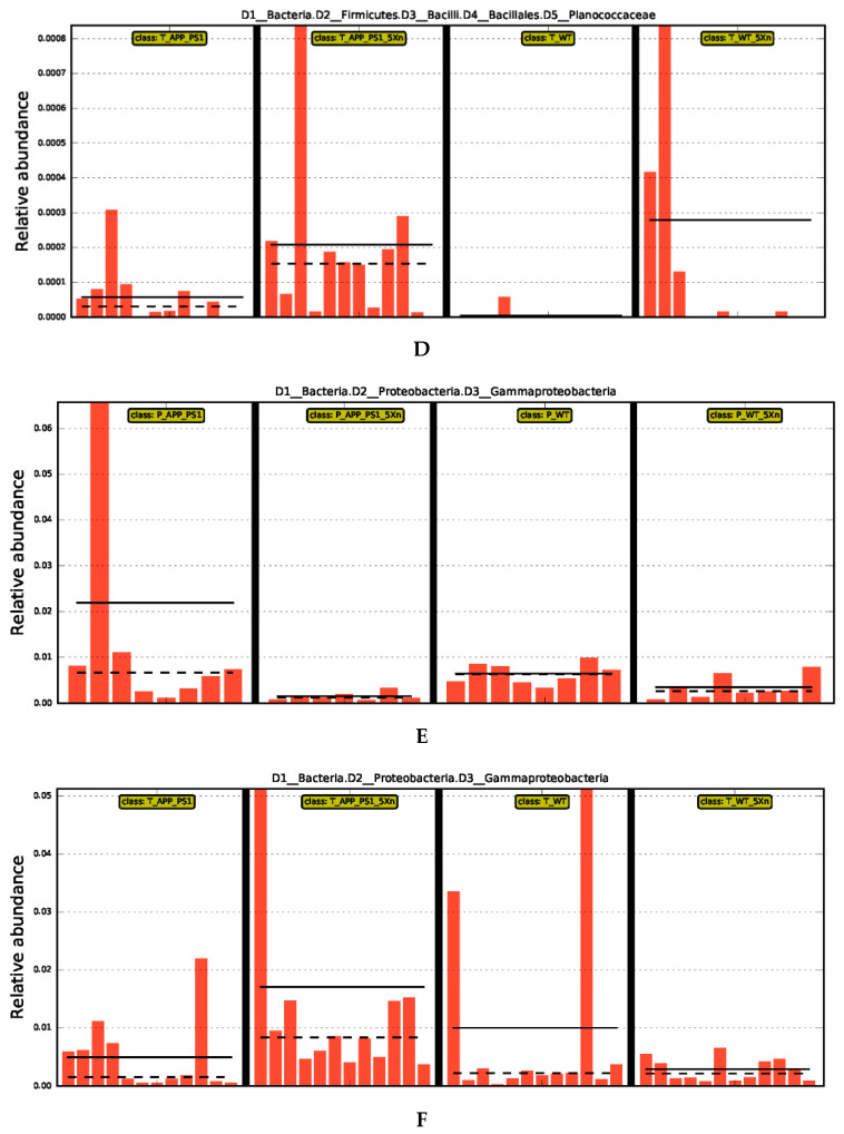
Figure 3.
Abundance histogram of three representative differential species. (A,C,E) Different species in the prevention experiment. (B,D,F) Different species in the therapy experiment. The X-axis represents different groups, the Y-axis represents the relative abundance of different species, and the orange bars with different lengths indicate the relative abundance of different species in each sample. In the groups of each mini-graph, the solid line represents the mean value within the group, and the dashed line represents the median value. LDA score was used to assess the impact of significantly differential species. The larger the score, the bigger the impact. The pictures show different species with LDA Score greater than 2.0. LDA, Line Discriminant Analysis.


