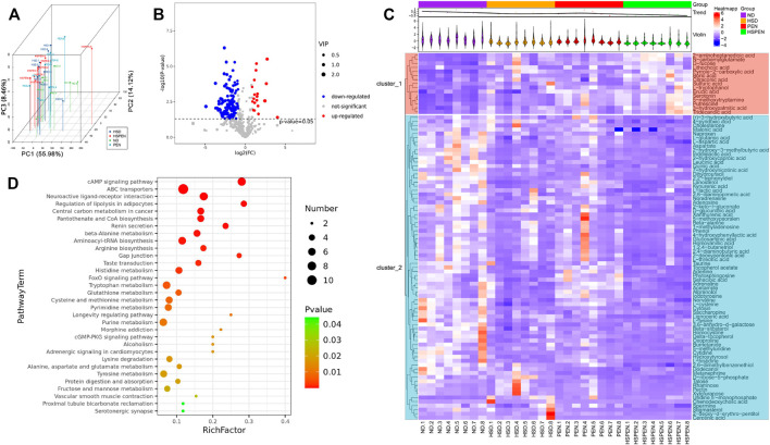
FIGURE 5.
Faecal metabolic analysis in the ND, HSD, PEN, and HSPEN groups. (A) Scatterplot of PCoA scores in the various groups. (B) The differential variables between the ND and HSPEN groups are shown via a volcano plot. Each metabolite is indicated by a dot, with down-regulation represented by red dots, up-regulation represented by blue dots, and no statistical difference represented by green dots. (C) Heatmap of 90 metabolites that were differentially (p < 0.01) abundant at standardised levels between the ND and HSPEN groups. The distances of the metabolites are expressed by the dendrogram according to their relative abundances. The normalised abundance values are described intuitively from red to blue, expressing the maximum and minimum abundances, respectively. (D) Enriched KEGG pathways in the ND group in contrast to the HSPEN group. The statistical significance values (p < 0.05) are described intuitively from red to green, showing the most and least differences, respectively. The size of the dot on the vertical axis indicates the metabolite count in the metabolic pathway.

