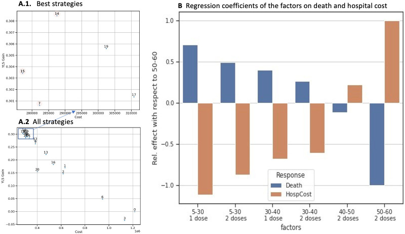
Figure 5.
Cost-effectiveness analysis and effects on deaths and hospital costs. (A1 and A2) The x-axis represents the hospitalisation cost and the y-axis represents the gain in YLS. (A1) shows a zoomed-in area of the best strategies and (A2) represents all strategies. (B) represents the regression coefficients according to age group and number of vaccine doses. On the x-axis, the factors represent the number of doses allocated according to age group and the y-axis shows the regression coefficient. blue bars represent deaths and orange bars represent hospitalisation costs. YLS, years of life saved.

