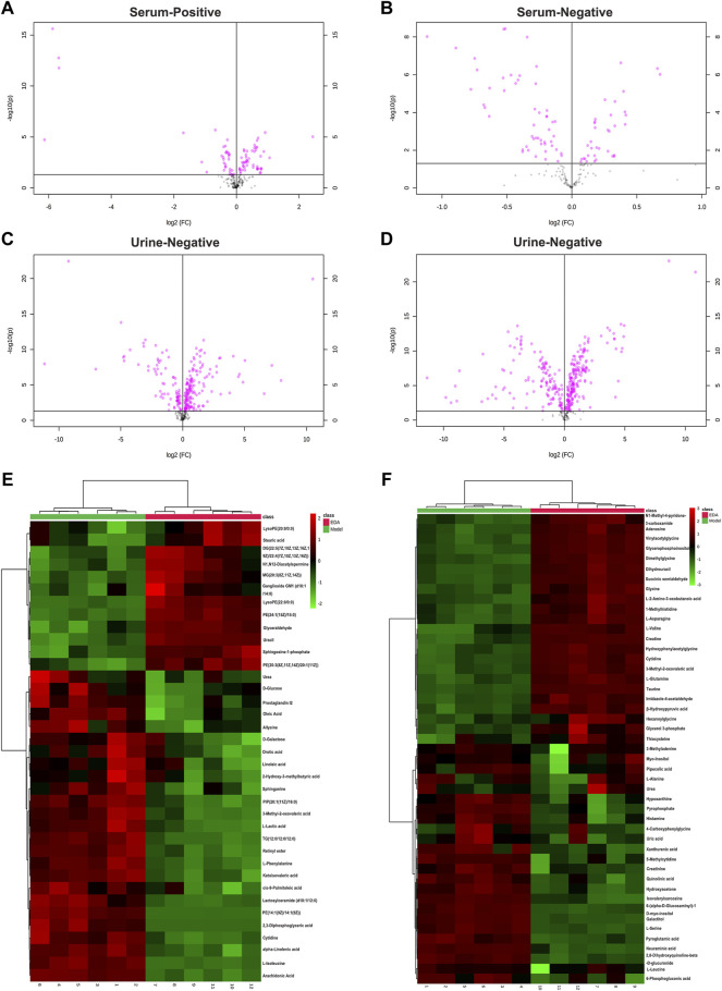
FIGURE 3.
Volcano plot and heatmap of the differential endogenous metabolites between the model and EDA group in serum and urine. (A–D) Volcano plot of model and EDA group. (E) Heatmap of the differential endogenous metabolites between the model and EDA group in serum. (F) Heatmap of the differential endogenous metabolites between the model and EDA group in urine. Red represented the metabolites in high abundance; green represented the metabolites in low abundance.

