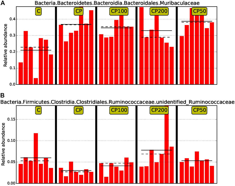
FIGURE 7.
The comparison of relative abundance of biomarkers with statistical differences between groups based on the LefSe results. The highest abundance of each biomarker in the sample was set as 1, while the rest samples were expressed by the value of relative abundance to the highest abundance sample. The solid line and dotted line represented the mean and median of the relative abundance of each sample respectively; C was the Control group, CP was the CY group, CP200 was the CY + CPPF-H group, CP100 was the CY + CPPF-M group, Q18 and CP50 was the CY + CPPF-L group; n = 7.

