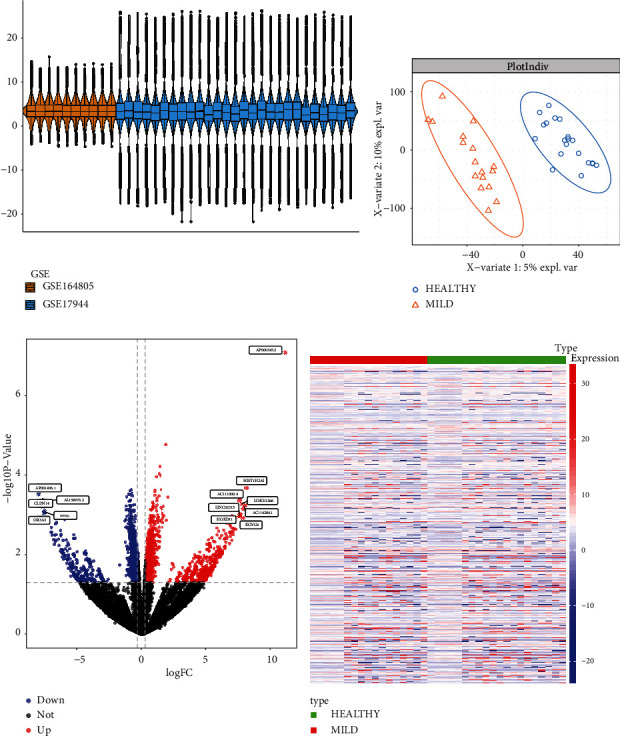
Figure 3.

Differential expression analysis. The box diagram of (a) after batch effect was removed, where the median of the sample was at the same horizontal line, indicating that batch effect had been removed successfully. PLS-DA was used to analyze healthy and mild COVID-19 samples. The figure showed a separation of the healthy group from the mild COVID-19 group, indicating a significant difference between the two groups (b). In the DEG volcanic diagram, blue was the downregulated gene, red was the upregulated gene, and the top 10 genes with the strongest expression differences were labeled with names (c). DEG expression level heatmap (d).
