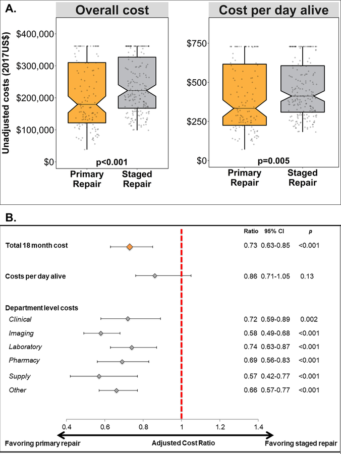
Central Figure: Comparisons of costs associated with Primary and Staged Repair Strategies.
A. This notched box plots depicts the unadjusted observed outcomes: total 18-month cost (left) and cost-per-day-alive (right). The central line depicts the median value, notches the 95% confidence interval of the median, the top and bottom of the box depict the 25th and 75th percentiles, whiskers depict 1.5 × the interquartile range, and gray circles depict individual observations. Data are truncated at the 80th percentile.
B. This Forest plot depicts the results of propensity score adjusted analyses. Depicted are the point estimate (diamond) and 95% CI (brackets). The cost ratio between primary repair and staged repair is depicted on the x-axis. The red dashed line marks a cost ratio of 1. The specific cost ratios, confidence intervals, and p-values are reproduced to the right of the graph.

