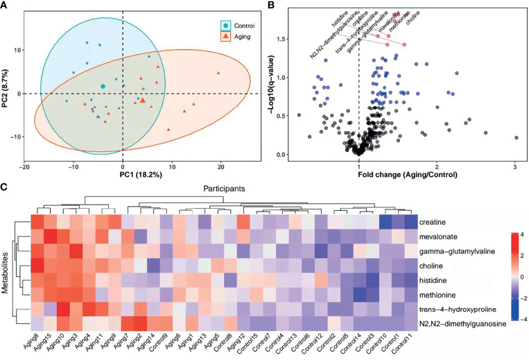
Figure 2.
PCA score plots, heatmap and levels of metabolites in different groups. (A), PCA plots and 2D clustering plots describing the trend of separation between the two groups. The red and green points mean the women with advanced and young ages, respectively. (B), Levels of each metabolite between the advanced age group and young control group were tested with unpaired Student’s t-test. The p-values of t-test were then adjusted with the FDR method to obtain q-values in consideration of multiple comparisons. Fold change was calculated as the ratio of mean of metabolites in the advanced age group to the young control group. In the volcano plot, -log10 (q-value) (y-axis) was plotted against the fold change (x-axis). The metabolites with p ≥ 0.05, p < 0.05 and q < 0.05 were shown with black, blue and red points, respectively. (C), Heatmap of the hierarchical clustering analysis. The selected metabolites (y-axis) for each participant (x-axis) were presented. Standardized levels of metabolites were shown in different colors. PCA, principal component analysis; 2D, two-dimensional; PC1, first principal component; PC2, second principal component.

