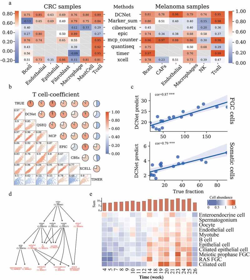
Figure 3.

Comparison of cell content assessed by DCNet with other methods. (a) Heatmaps of the correlation between the estimated and true levels of cells on CRC samples and Melanoma samples by different methods. The left side is the CRC sample, and the right side is the Melanoma sample. The redder the color, the closer the correlation level is to 1. The methods include DCNet, Marker_sum (the expression value of marker genes screened in this topic), CIBERSORTx, EPIC, MCP-counter, quanTIseq, TIMER, xCell. The longitudinal direction indicates different cell types. Gray represents that this cell type can not be identified by the corresponding deconvolution method. (b) In the simulation data, the consistency analysis of different methods. The scatter chart shows the distribution of 1000 simulation samples among different methods, and the pie chart shows the level of correlation. The redder the color, the higher the correlation. The diagonal lines are the names of different models, and TRUE is the true level of cell content. (c) The correlation between the predicted value of the DCNet model and the true level. The abscissa is the true cell content, and the ordinate is the cell content predicted by DCNet. The upper part represents FGC cells and the lower part represents Somatic cells. (d) Cell ontology hierarchical relationships among FGC cell, somatic cell, and cell subclasses of those cells, each node represents a cell ontology identity. Highlighted red indicates the cell types recognized by DCNet. (e) enriched cell types evaluated by DCNet shows a big difference in cell abundance levels of human embryos at the developmental stage. The redder the color, the higher the level of cell abundance. The y-axis of the histogram (at the top of 3E) is the sum of the overall cell abundance level of human embryos at each week.
