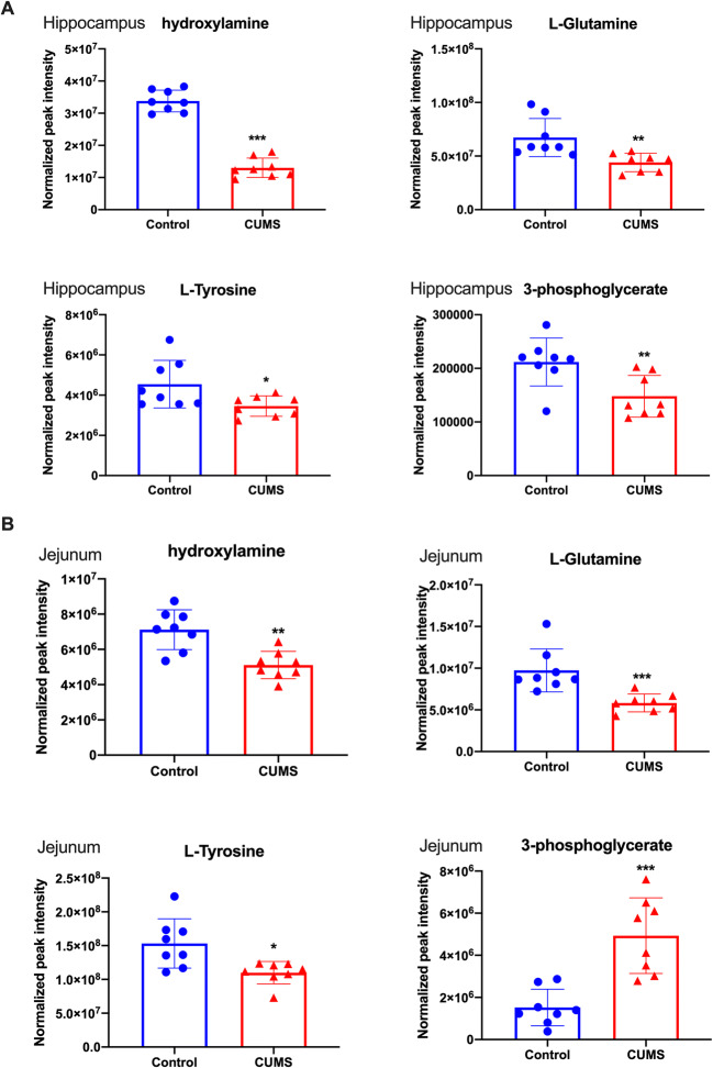
Fig. 5.
Scatter plots of significantly changed metabolites normalized peak intensity in rat hippocampus (A) and jejunum samples (B). The x-axis shows the specific metabolite’s normalized peak intensity, and each scatter represents a corresponding sample of the rat.  represents hippocampus samples of control,
  represents hippocampus samples of UCMS,
  represents jejunum samples of control,
  represents jejunum samples of UCMS, the scatter plots show the mean and SD of the metabolites. *p<0.05, **p<0.01, vs. control (n = 8)

