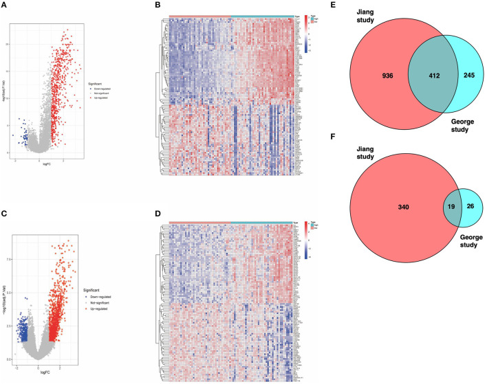
Figure 1.
(A) Volcano map of dataset from the George cohort (Red dots represent upregulated genes, blue dots represent downregulated genes, and gray dots indicate no difference in expression). (B) Heat map of the DEGs identified from the George cohort. (C) Volcano map of the Jiang cohort. (D) Heat map of DEGs identified from the Jiang cohort. (E) Venn diagram. The intersection represents the upregulated genes in the high-score cohort of both datasets. (F) Venn diagram. The intersection represents the downregulated genes in the high-score cohort of both datasets.

