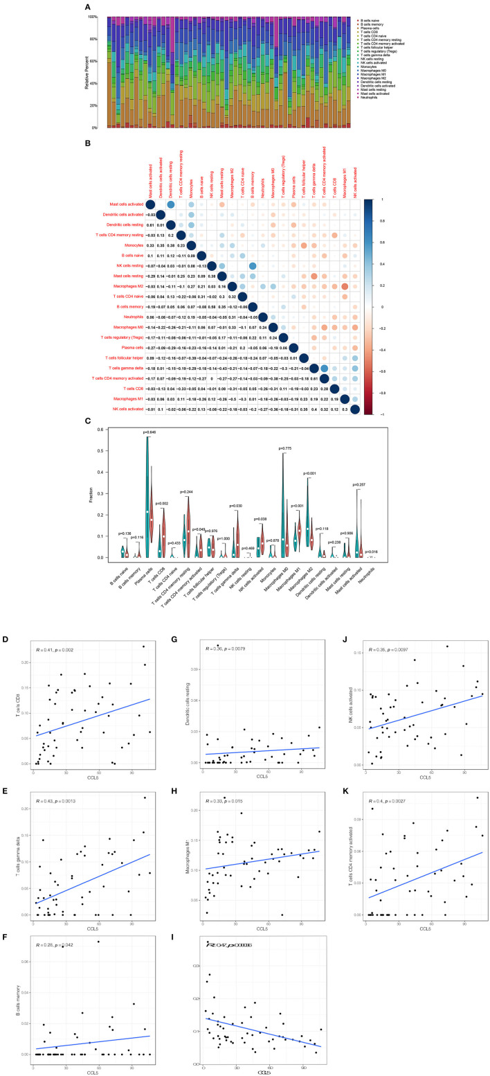
Figure 6.
(A) Bar plot shows the proportion of 21 types of TICs in SCLC tumor samples. (B) The heatmap shows the correlation between 21 TICs and the value in each small box and represents the P-value of the correlation between the two cells. The shadows in each tiny color box represent the corresponding correlation values between the two cells, and significance was assessed using Pearson's coefficient. (C) The violin plot shows the proportional differentiation of 21 immune cells relative to the median level of CCL5 expression in SCLC tumor samples with low or high CCL5 expression. (D–K) Scatter plot showing that the proportion of 8 TICs was correlated with CCL5 expression (P < 0.05). The blue line in the figure indicates the fitted line of the linear model, indicating the proportion of immune cells and CCL5 expression. Pearson's coefficient was used for the correlation test.

