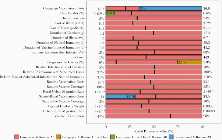
Figure 5.
One-way sensitivity analysis. Figure depicts the preferred strategy when all parameters are held at their mean values and a single parameter is adjusted over its full range. Thick black lines indicate the mean values for each parameter. The x-axis indicates the parameter value when it is scaled from 0% to 100%, with 0% representing the minimum, 100% representing the maximum, 50% representing the median, and so on. The x-axis locations where the graph changes color indicate the threshold of that parameter value at which the optimal strategy changes. Parameter minima and maxima are displayed on the plot margins.

