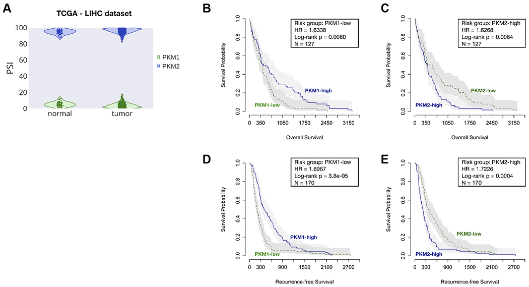
Figure 7. Survival analysis for PKM1 and PKM2 isoforms in the LIHC cohort of TCGA.

(A) The violin plot shows the distributions of PSI values of PKM1 (green) and PKM2 (blue) in adjacent-normal and tumor samples, respectively. The survival plots show overall survival (B and C) and recurrent-free survival (D and E), as well as risk group, hazard ratio (HR), log-rank p value, and the total number of patient samples (N) by categorizing patients into high and low groups, based on the median PSI values. Risk group indicates whether the high or low group has worse survival outcome.
