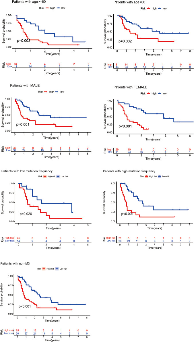
FIGURE 3.
Kaplan–Meier curves of high- and low-risk groups of elderly and non-elderly patients and male and female patients. In the Kaplan–Meier curve of different clinical subgroups of patients with AML, the X- and Y-axes represent the time and probability of survival, whereas the red and blue lines represent the high- and low-risk groups, respectively.

