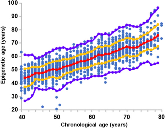
Fig. 1.

The overall relation between epigenetic age and chronological age. Each blue point represents a single healthy individual. Red dots are the average value of the epigenetic age at each chronological age connected by a regression curve (red line). All dots between the orange and the red lines represent individuals with an epigenetic age between Avg and Avg ± 1SD. Dots residing between the orange and the purple lines represent individuals with an epigenetic age between Avg ± 1SD and Avg ± 2.5 SD. Eighteen blue dots residing below or above the purple lines were considered as outliers
