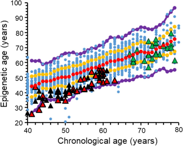
Fig. 5.

The overall relation between epigenetic age and chronological age, including the samples from diabetic subjects. Each blue point represents a single healthy individual. Red dots are the average value of the epigenetic age of the healthy cohort at each chronological age. The diabetic subjects are represented by triangles, superimposed on the general healthy cohort; red triangles are for T1D subjects receiving intensive treatment and are free of complications; black triangles are for T1D subjects receiving conventional therapy who developed microvascular complications (albuminuria and /or retinopathy); and green triangle marks are for T2D. All dots between the orange and the red lines represent individuals with an epigenetic age between the average and average ± 1SD. Dots residing between the orange and the purple lines represent individuals with an epigenetic age between the average ± 1SD and the average ± 2.5 SD
