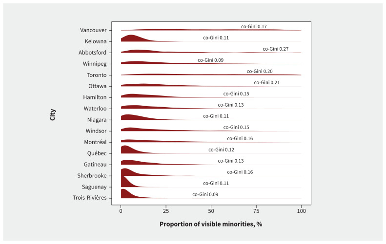
Figure 2:
Distribution of proportion of visible minorities and Gini covariance coefficients by city. The curves (red) represent the density distributions of the dissemination area–level proportions of visible minorities for each census metropolitan area (i.e., city). Flatter curves indicate that the proportions of visible minorities by dissemination area are more evenly distributed over the 0%–100% range (e.g., Vancouver, Toronto, Montréal). Density distributions concentrated near 0% (to the left) show that most dissemination areas had low proportions of visible minorities (e.g., Saguenay, Trois-Rivières). For reference, the Gini covariance coefficients (co-Gini) are also displayed. These represent the degree of geographical concentration of SARS-CoV-2 cases by social determinant, with value closer to 1 reflecting greater inequality and values closer to 0 representing uniform distributions.

