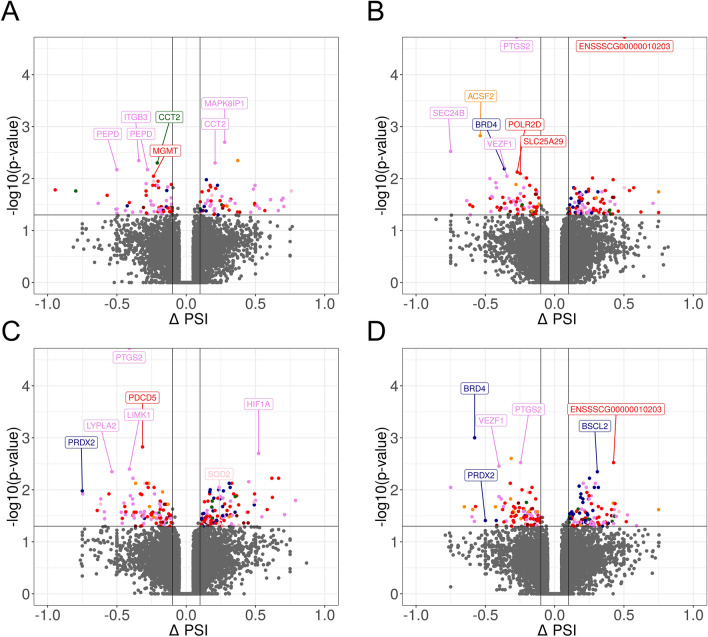
Figure 4.
Volcano plot presenting the abundance of alternative splicing events (ASEs) in each experimental comparison: (A) LPS versus controls; (B) PGJ2 versus LPS, (C) pioglitazone versus LPS; (D) T0070907 versus LPS. The ∆PSI values of each ASE are presented on the X-axis, and the negative logarithmic adjusted p-value is presented on the Y-axis. Horizontal lines are equal to the negative logarithmic value of the adjusted p-value cut-off (0.05). Colored dots represent different types of significant DASEs (adjusted p-value < 0.05), and grey dots represent non-significant ASEs. The most interesting DASEs are labeled with gene symbols. The plots generated in maser bioconductor software.

