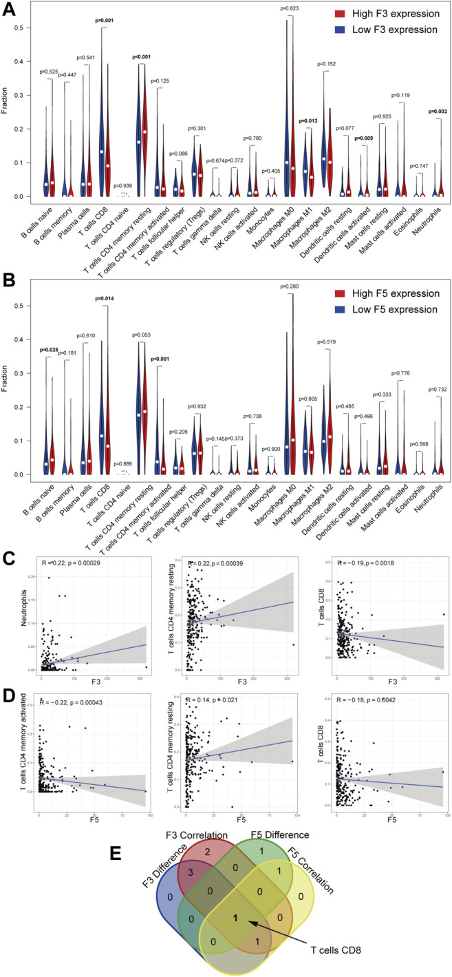
FIGURE 9.

Correlation of the TIC proportion with the expression of D-dimer-related genes. (A–B) Violin plot displaying the ratio differentiation of 22 immune cell types between STAD tumor samples with low or high F3 and F5 expression relative to the median gene expression level. Wilcoxon rank sum for the significance test. (C–D) Scatter plots showing the correlation of the top 3 TIC proportions with F3 and F5 expression (p < 0.05). Pearson’s coefficient for the correlation test. (E) Venn plot displaying the overlapping F3 and F5 cells—namely, CD8 T cells.
