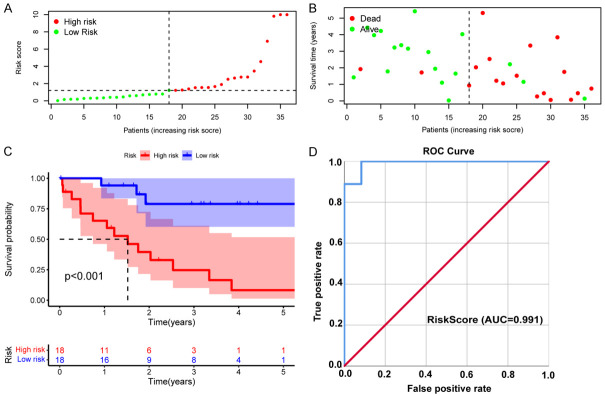
Figure 3.
Validation of the riskScore prognostic model in TCGA-CHOL cohort. A. Distribution of riskScores. Green dots indicate the patients in the low-risk group, and red dots indicate the high-risk group. B. Survival status of high- and low-risk patients. Red dots represent dead patients, and green dots represent surviving patients. C. Kaplan-Meier survival curve for OS. D. The AUC of the ROC curve was used to evaluate the diagnostic value of the riskScore in the CHOL cohort.

