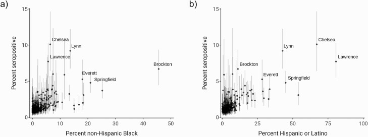
Figure 5.
Comparison of percent non-Hispanic Black (left) and percent Hispanic or Latino (right) with estimated seroprevalence by community. Dots indicate mean of the posterior seroprevalence distribution, and shaded regions indicate 90% credible intervals. Communities with a lower 90% credible interval above 3% seropositivity are labeled.

