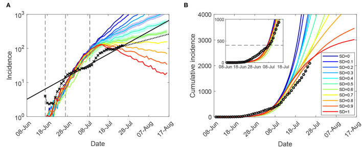
Figure 1.
Moderate restrictions (NSW; progressive vaccination rollout; suppression threshold: 400 cases): a comparison between simulation scenarios and actual epidemic curves, under moderate interaction strengths (CIc = CIw = 0.25, HQc = HQw = 0.25, SDc = 0.25, SC = 0.5). A moving average of the actual time series up to 25 July for (A) (log-scale) incidence (crosses), and (B) cumulative incidence (circles); with an exponential fit of the incidence's moving average (black solid: βII, and black dotted: βIII). Vertical dashed marks align the simulated days with the outbreak start (17 June, day 9), initial restrictions (27 June, day 19), and tighter lockdown (9 July, day 31). Traces corresponding to each social distancing (SD) compliance level are shown as average over 10 runs (coloured profiles for SD varying in increments of 10%, i.e., between SD = 0.0 and SD = 1.0). 95% confidence intervals for incidence profiles, for SD∈{0.4, 0.5, 0.6}, are shown as shaded areas. Each SD intervention, coupled with school closures, begins with the start of tighter lockdown, when cumulative incidence exceeds 400 cases (B: inset). The alignment between simulated days and actual dates may slightly differ across separate runs. Case isolation and home quarantine are in place from the outset.

