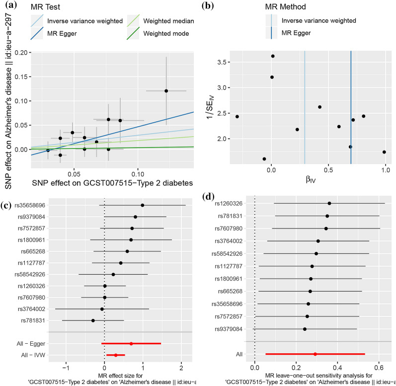
Fig. 2.
2SMR analysis of the causal association between T2D and the risk of AD. a Scatter plot. The slope of the line corresponds to a causal estimate using each of the four different methods. b Funnel plot. The vertical line shows a causal estimate using all SNPs combined into a single instrument for each of two different methods. c Forest plot. Each black dot represents the MR estimate of each SNP using the wald ratio, and the horizontal line represents the 95% CI. The red points show a combined causal estimate using all SNPs in a single instrument, including the 2SMR estimates of IVW and MR-Egger. d Leave-one-out sensitivity analysis. Each black dot represents the result of MR-IVW excluding that particular SNP, and the red dot depicts the IVW estimate using all SNPs

