Figure 4.

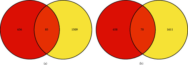
The overlapping between two GEO data sets is shown by a Venn diagram. The Venn diagram indicates the overlaps in upregulated (a) and downregulated genes (b) in the given two data sets.

The overlapping between two GEO data sets is shown by a Venn diagram. The Venn diagram indicates the overlaps in upregulated (a) and downregulated genes (b) in the given two data sets.