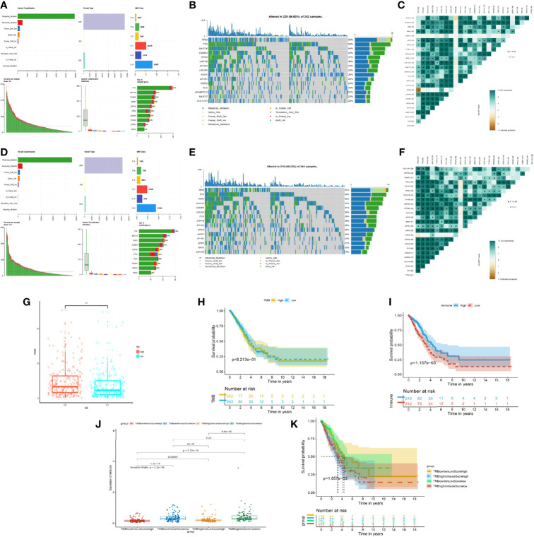
Figure 6.
Mutation situation of the prognostic risk model groups. (A) Landscape of mutation in the high-risk group from The Cancer Genome Atlas (TCGA). (B) Waterfall plot demonstrating the 15 genes with the most mutations and mutated types in the high-risk group from TCGA. (C) Co-mutated plots of 25 genes from TCGA by somatic interaction function in the high-risk group from TCGA. (D) Landscape of mutation in the low-risk group from TCGA. (E) Waterfall plot demonstrating the 15 genes with the most mutations and mutated types in the low-risk group from TCGA. (F) Co-mutated plot of 25 genes from TCGA by somatic interaction function in the low-risk group from TCGA. (G) Box plot showing the difference between the high- and low-risk groups about tumor mutation burden (TMB). P-values were calculated with the Wilcoxon test (***P < 0.001). (H) Kaplan–Meier curve of the low- and high-TMB groups. (I) Kaplan–Meier curve of the low- and high-immune-score groups. (J) Box plot showing the difference of the risk score in the four groups, including high immune score and high TMB, high immune score and low TMB, low immune score and high TMB, and low immune score and low TMB. P-values were calculated with the Wilcoxon test. (K) Kaplan–Meier curve of four groups.

