. 2022 Feb 25;11:e71994. doi: 10.7554/eLife.71994

Figure 1. Gene count imbalances affect signature scoring.

(A) The number of detected genes in tumor and normal cell populations in 10 single cell cancer RNAseq datasets. The height of each bar represents average, and whiskers represent standard deviation. In all cases, the difference is statistically significant (student t test, p < 2.2e-16). (B) Percentage of up and down regulated gene signatures in cancer cells relative to normal cells based on Cohen’s d. Dot size corresponds to the percentage of all signatures tested (n = 7503). (C) Spearman correlation coefficients of Cohen’s d with signature sizes across the datasets and methods. Asterisk (*) in each cell indicates p-value < 0.01. Color of the heatmap represents correlation coefficient. (D) Scores of a cell cycle gene set (GO:0007049) calculated using four methods along with MKI67 expression, gene counts, and cell cycle phases predicted by Seurat in Tumor and normal cell populations of HNSC dataset (GSE103322). The red box highlights non-cycling tumor cells that exhibit higher scores than non-cycling normal cells.

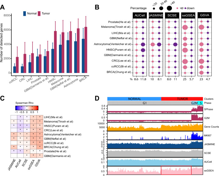
Figure 1—source data 1. Source data for Figure 1.

Figure 1.

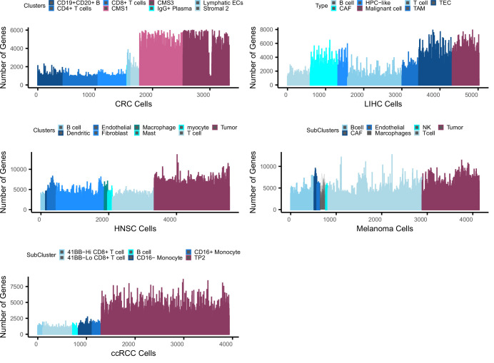
Figure 1—figure supplement 1. Bias in gene counts.

Figure 1—figure supplement 1.

Number of genes expressed in tumor and normal cell types across five single cell data sets including colorectal cancer (CRC), liver cancer (LIHC), head and neck cancer (HNSC), melanoma, and clear cell renal carcinoma (ccRCC). Maroon colors represent tumor cell populations in each data set while blue represents normal cell populations across the datasets. Note that in the LIHC dataset, CAF, TAM, and TEC are cancer-associated fibroblasts, tumor-associated macrophages, and tumor-related endothelial cells, respectively.
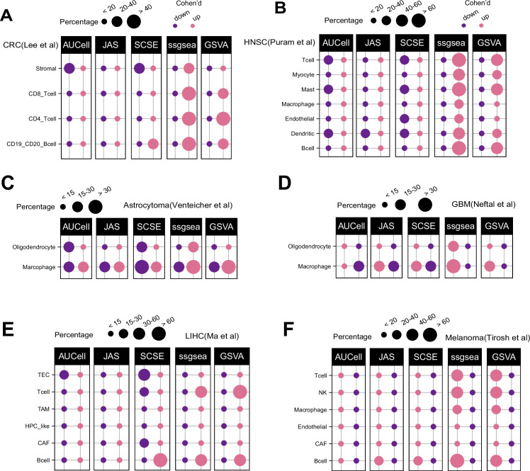
Figure 1—figure supplement 2. Patterns of up and down regulated signatures.

Figure 1—figure supplement 2.

Comparing tumor and normal cell populations across six additional datasets, including (A) colorectal, (B) head and neck cancer, (C) astrocytoma, (D) IDHwt GBM, (E) liver, and (F) melanoma. The size of each dot represents the percentage of up or down signatures over all signatures tested (n = 7503).
Figure 1—figure supplement 3. GSVA and ssGSEA comparison.

Figure 1—figure supplement 3.

Comparison of effect size (Cohen’s d) for ssGSEA (x-axis) and GSVA (y-axis) in four datasets: colorectal cancer (CRC) , head and neck cancer, melanoma, and clear cell renal carcinoma. Red line represents X = Y and black line is the regression line. Correlation is calculated using Spearman method.