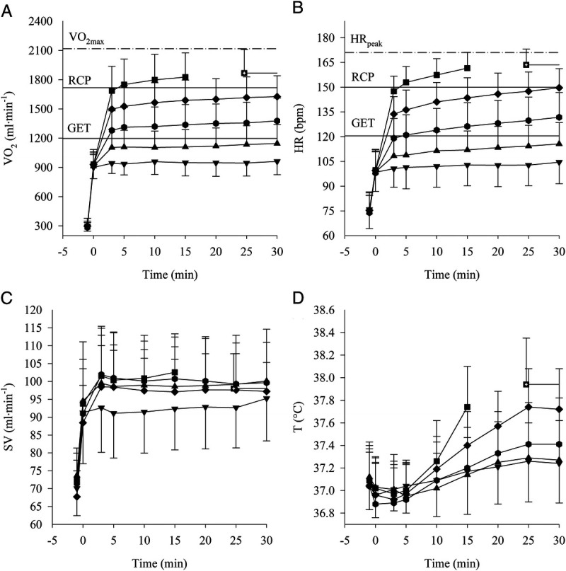
FIGURE 1.

Data collected during CWR at 40% (▼), 50% (▲), 60% (●), 70% (♦), and 80% (■) of V̇O2max are plotted as a function of time. Mean ± SD of HR (A), oxygen uptake (B), SV (C), and body temperature (D). The three horizontal line plots in panels A and B indicate from the lowest to the highest: GET, RCP, and peak value as identify from the ramp test.
