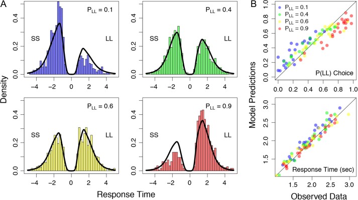
Figure 5.
Predictions from the downstream model against the observed data. (A) Choice response time distributions as shown as histograms for each value condition: (blue; top left panel), (green; top right panel), (yellow; bottom left panel), and (red; bottom right panel). In each panel, response time distributions are separated by their choice, where shorter sooner choices appear on the negative axis, and larger later choices appear on the positive axis. Predictions from the best-fitting model (i.e., the last row of Fig. 2C) are shown as black densities overlaying the observed data. (B) Mean choice probabilities (top panel) and mean response times (bottom panel) are shown for the observed data (x-axis) against the model predictions (y-axis). The summary statistics are shown for each individual subject in each of the 4 conditions, color coded according to the legend in the top panel.

