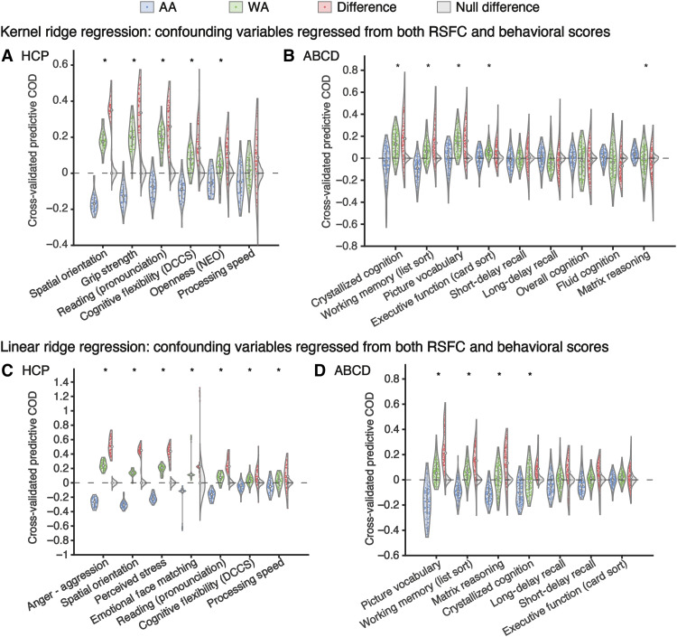
Fig. 3. The prediction error is larger (i.e., lower predictive COD) in AA than matched WA in the HCP dataset (left) and the ABCD dataset (right).
Each violin plot shows the various predictive COD across 40 data splits in (A) and (C) and across 120 training-test splits in (B) and (D). Blue and green violins represent AA and WA, respectively. Red violins are the difference. Gray violins show the null distribution of difference generated by flipping the AA versus WA labels. Asterisk indicates that the difference in predictive COD between matched AA and WA is significant (FDR controlled at q = 5%). Gray dashed line indicates 0.

