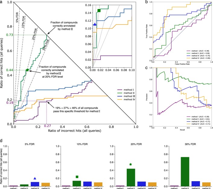
Extended Data Fig. 1. Introducing hop plots.
(a) Hop plots allow us to simultaneously assess a methods annotation rate and its power to separate correct and incorrect hits. Two methods with identical annotation rate will end up in the same point (x, y) with x + y = 1, see methods I and III; these methods can differ substantially in their separation power. The plot shows which method performs best for a desired number of correct annotations (horizontal lines, not shown), incorrect annotations (vertical lines, not shown), or false discovery rate (FDR, dashed lines). For example, if we are willing to accept three incorrect annotations from a total of N = 100 queries, then method IV clearly outperforms method I; this ordering is reversed if we consider all queries (x + y = 1). FDR levels correspond to lines through the origin; a hop curve may cross or touch some FDR line multiple times, or only in the origin. We report the maximum number of correct annotations among all crossing points. For example, method II returns 55 hits (44 correct, 11 incorrect) at FDR 20 % (star). We are usually interested in small FDR values such as FDR 10 %, so a zoom-in shows where different curves cross the corresponding FDR lines: For example, method III returns 11 hits (all correct) at FDR 5 % (triangle, zoom-in), and method II returns 15 hits (14 correct) at FDR 10 % (square, zoom-in). See Online Methods for further details. (b) ROC plot and (c) precision-recall curve for the data shown in (a). Both plots (b) and (c) hide the information that method II is by far the most powerful method. (d) Bar plots for four FDR levels. Notably, the information from the bar plot can directly be read from the hop plot: We mark the corresponding values by star, triangle and square, compare to the corresponding marks in (a).

