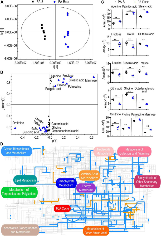
FIGURE 4.
Identification of biomarkers and iPath analysis in PA-RSCF. (A) The PCA analysis between PA-S and PA-RSCF. Each dot represents the technique replicas in the plot. (B) S-plot generated from OPLS-DA. Triangle represents individual metabolite, where potential biomarkers are highlighted with blue, which is greater than or equal to 0.05 and 0.5 for absolute value of covariance p [1] and correlation p(corr) [1], respectively. (C) The scatter plot of biomarkers in data (B). (D) iPath analysis. Blue and yellow lines represent decreased and increased metabolisms, respectively. Out of 49 significant metabolites (p < 0.05), 46 were submitted to the online website (https://pathways.embl.de).

