
FIGURE 2.
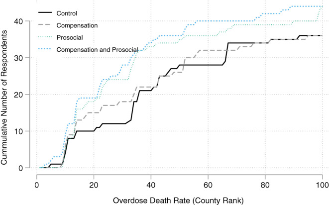
Response rate by county rankings by 2017 opioid overdose death rates. This figure shows the cumulative number of responses by treatment group over counties ranked by opioid overdose death rates in 2017, with 1 being the lowest county death rate and 100 being the county with the highest death rate. Source: Authors' analysis of study data [Color figure can be viewed at wileyonlinelibrary.com]