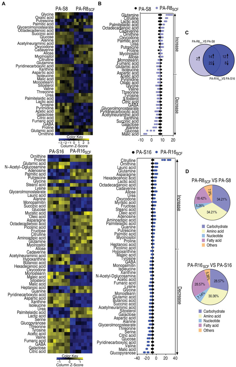
Figure 3.
Differential metabolome of SCF-resistant Pseudomonas aeruginosa. (A) Heat maps showing differential metabolites in PA-R8SCF and PA-R16SCF compared with those in PA-S8 and PA-S16, respectively. Yellow color and blue color indicate increase and decrease of metabolites relative to the median metabolite level, respectively (see color scale). (B) Z-score plot of differential metabolites in PA-R8SCF and PA-R16SCF based on controls PA-S8 and PA-S16, respectively. The data were separately scaled to the mean and SD of the controls. Each point represents one metabolite in one technical repeat and colored by sample types. (C) Venn diagram for comparison of differential metabolites between PA-R8SCF and PA-R16SCF. (D) Categories of the differential metabolites. Differential abundances of metabolites are searched against in KEGG for their categories, and the pie chart is generated in Excel 2010 (Microsoft, United States).

