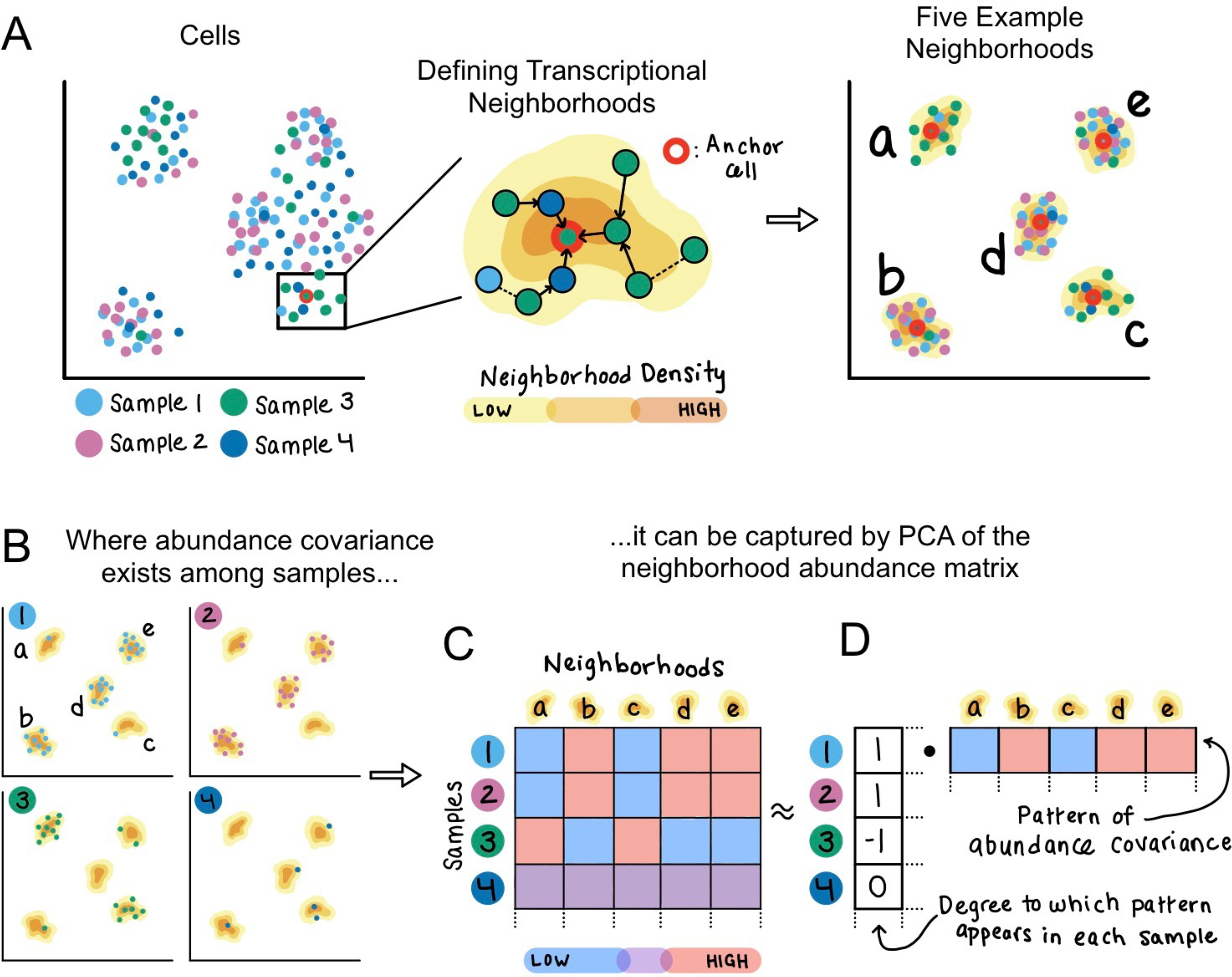
Figure 1: Method schematic.

(A) Given an example dataset of single cells sampled from four individuals, CNA defines one transcriptional neighborhood per cell in the dataset. Each other cell in the dataset belongs to this neighborhood according to the probability that a random walk in the cell-cell similarity graph from that cell will arrive at the neighborhood’s anchor cell after a certain number of steps. Five example neighborhoods a-e are depicted. (B) Examining the representation of cells from each sample in these example neighborhoods identifies a pattern of abundance covariation. Neighborhoods b, d, and e tend to have a high abundance when neighborhoods a and c have low abundance, and vice versa. This covariation pattern appears in samples 1–3 but not in sample 4. (C) The neighborhood abundance matrix (NAM) quantifies the fractional abundance of cells in each neighborhood for each sample; we indicate higher abundance with red and lower abundance with blue. (D) Dominant patterns of abundance covariation across neighborhoods can be illuminated by factorizing the NAM, for example with PCA. The principal component corresponding to this example has per-neighborhood loadings that capture the neighborhood covariance pattern, as well as per-sample loadings that reflect the degree to which the covariance pattern appears in each sample.
