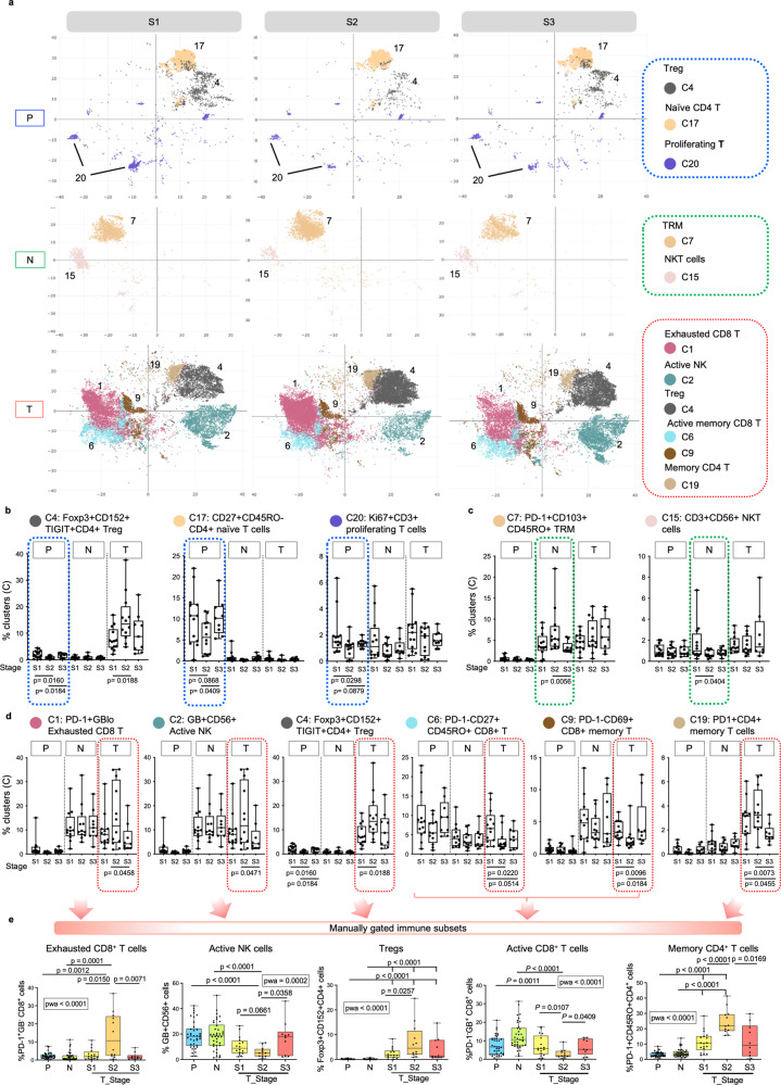
Fig. 2. Peak of immune evasion at stage II HCC.
a tSNE plots showing the distributions of selected immune clusters that are significantly different in abundance from PBMC (P), Non-tumour (N) or tumour (T) compartments across three TNM stages. b Graphs showing percentages of clusters with significant differences across TNM stages in P (blue boxes). c Graphs showing percentages of clusters with significant differences across TNM stages in N (green boxes). d Graphs showing percentages of clusters with significant differences across TNM stages in T (red boxes). e Graphs showing the percentages of manually gated immune populations from total live immune cells (by flowjo) in P, N and T across S1, S2 and S3 HCC. The bar and arrows indicate the major immune cell lineages shown below. a–d TNM stage I, II and III (S1, S2 and S3). nPS1 = 13, nPS2 = 12, nPS3 = 9, nNS1 = 12, nNS2 = 12, nNS3 = 9, nTS1 = 13, nTS2 = 12, nTS3 = 9. b–e Phenotypes are indicated on top. b–e Boxplots show median and the whiskers represent minimum and maximum values with the box edges showing the first and third quartiles. One-way ANOVA test with two-sided p-values by unpaired two-sided Mann–Whitney U (MWU) tests for two-group comparisons. e nPS1-S3 = 38, nNS1-S3 = 38, nTS1 = 16, nTS2 = 12, nTS3 = 10. Source data are provided as a Source Data file.

