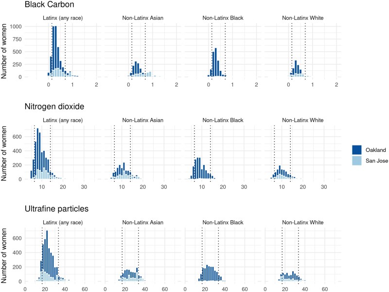
Figure 1.
Distribution of pollutants for pregnant women delivering live-born neonates between 2013 and 2015 in Oakland and San Jose, California. Dashed lines correspond to the 10th and 90th percentiles of the distribution across all four races/ethnicities. The distribution of ultrafine particles excludes one outlier that equals 205 from this visual display.

