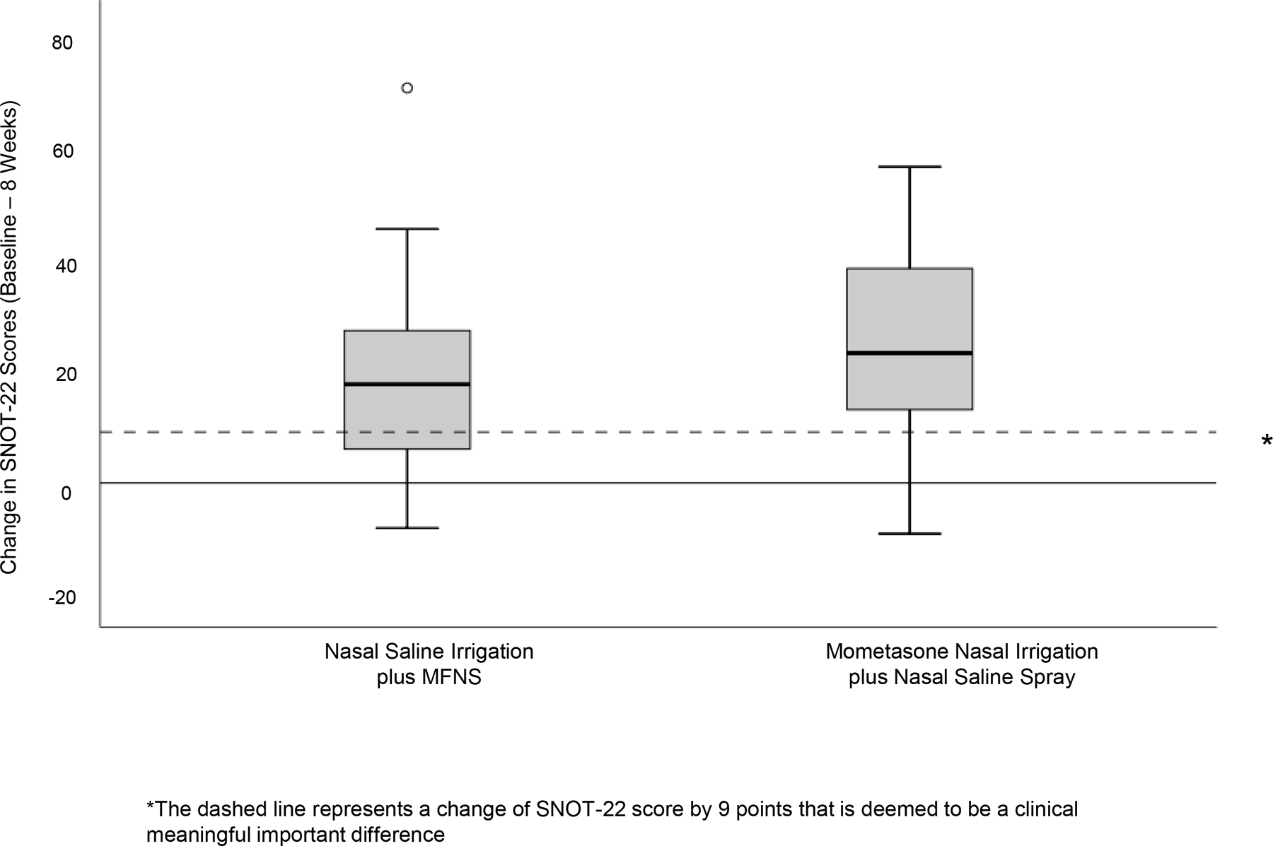
Figure 3.

Comparison of Change in SNOT-22 Scores Between the 2 Treatment Groups. *The box and whisker plots represent change in SNOT-22 within each treatment group. The solid dashed line within the box represents the median value, the upper and lower part of the box represents the 75th and 25th percentile, the “whiskers” represent the upper and lower extreme of values, and the open circle represents outliers. The dashed horizontal line represents the clinically meaningful important difference of SNOT-22 score by 9 points.
