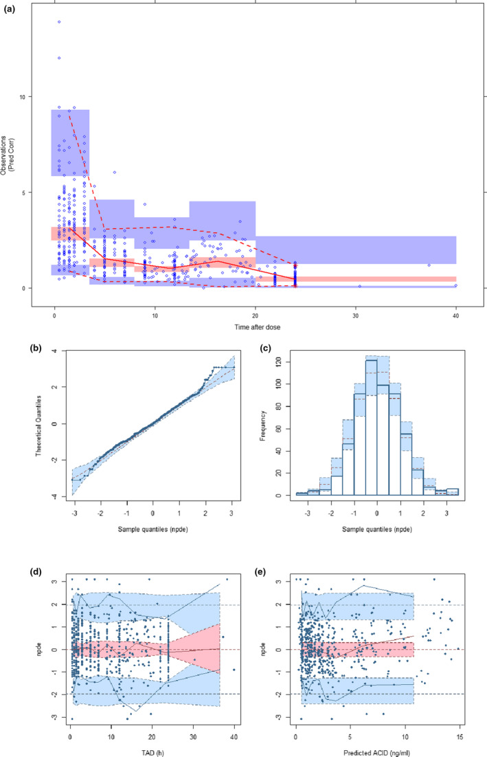
FIGURE 3.

(a) Prediction‐corrected visual predictive check. (b to e) Normalized distribution prediction error (NPDE), (b) Q‐Q plot of NPDE, (c) Histogram of NPDE. Shaded area represents theoretical distribution, (d) NPDE versus time after dose (TAD). Shaded areas represent the prediction intervals associated with the 5th, 50th, and 95th percentiles. (e) NPDE versus predicted concentrations
