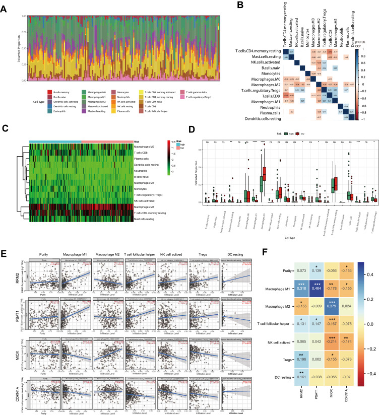
Figure 8.
Immune fraction in low-risk compared to high-risk patients. (A) Bar plot of the immune fraction denoted by different colors. (B) Correlation of immune fraction. (C) The heatmap of immune fraction based on risk score. (D) Box plots depicting the CIBERSORT scores of 22 immune cells of the high-risk patients compared with low-risk patients. (E and F) The correlation with the expression level of signature genes and the immune infiltration cells. Adjusted P-values were showed as: ns, not significant; *P < 0.05; **P < 0.01; ***P < 0.001; ****P<0.0001.

