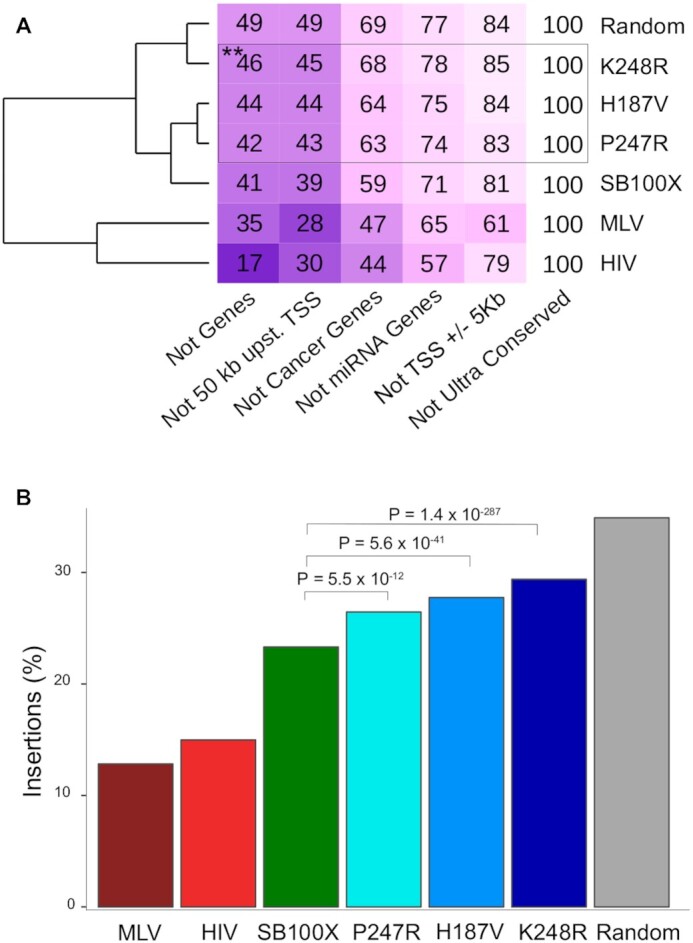
Figure 6.

Insertion frequencies in genomic safe harbors. (A) The numbers in the boxes indicate the percentages of the insertions per condition that fall in the in the safe harbor sub-categories listed below the table. Note the overlapping nature of the categories, which explains why the sums of the numbers per condition exceed 100%. Darker boxes correspond to lower values in the boxes, indicating under-representation of insertions in the safe harbor sub-categories. The dendrogram on the left is based on the mean values of the rows; thus, it clusters conditions by their overall similarities of insertion frequencies in genomic safe harbors. Statistical analysis by Fisher's exact test, ** P< 0.001 as compared to SB100X. (B) Overall representation of insertions in genomic safe harbors.
