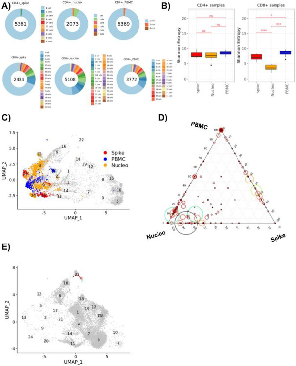
Figure 4. TCR repertoire analysis across steady state and spike or nucleoprotein restimulated T cells.
A) Pie charts displaying the expansion of differently sized CD4+ and CD8+ T cell clones for samples grouped based on their sample type (spike stimulated, nucleoprotein stimulated and PBMC). Numbers in the center of the pie charts stand for the total number of cells of that particular group. A slice in the pie chart with a specific color displays the percentage of cells belonging to clones of size corresponding to this color. Clones that constitute less than 1% of the total population are only available in the pie legend. B) Box plots displaying the distribution of the donor specific Shannon entropy values computed based on the CD4+ and CD8+ T cell clones of each donor stratified by the spike, nucleo protein and PBMC samples. C) UMAP plot displaying the CD8+ cells, where cells of the expanded clones (n > 20) are highlighted. D) Ternary plot of expanded CD8+ clones (clone size > 2) displaying the percentages of PBMC (top corner), Nucleo protein (left corner), and Spike (right corner) cells in the clones. Each clone is depicted as a circle where the circle size and color shows the size of the clone (min =3, max = 221). E) Umap plot displaying the CD4+ cells, where the members of a cytokine producing clone in donor256 are highlighted with red.

