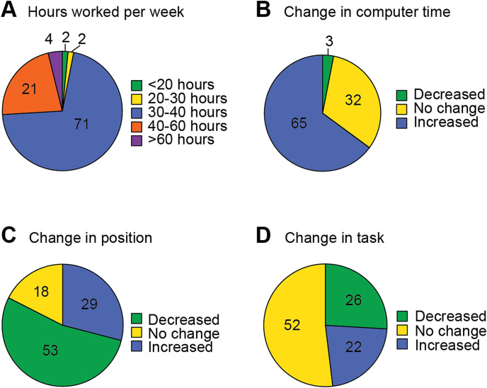
Fig. 2.
Change in work habits when working from home. In each pie chart, n = 131 and the full “pie” = 100% of responses. Each “wedge” of the chart represents the proportion of the responses for each category. A: Reported number of hours worked per week. B: Reported change in time spent working at the computer. C: Reported difference in position changes throughout the workday. D: Reported difference in task changes throughout the workday.

