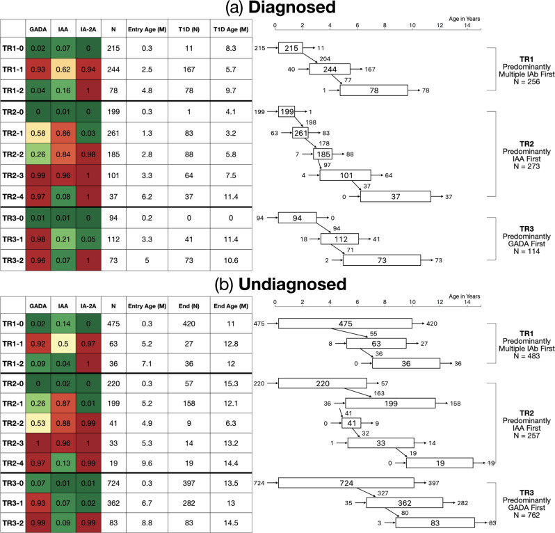
Fig. 2. State transition diagram for diagnosed and undiagnosed participants in the three trajectories.
State transition diagram for D Diagnosed (a) and UD Undiagnosed (b). The table on left again shows probability of positivity for each islet autoantibody, total number of individuals in each state, median entry age (years) per state, number of individuals who are diagnosed (D) or lost in observation (UD) per each state and median age of type 1 diabetes diagnosis or last observation (years) for D and UD, respectively. Figure on right shows (i) how many participants enter each state (left-sided entry arrow); (ii) how many participants were diagnosed (D) or ended their observation (UD) at each state (right-sided exit arrow); (iii) how many participants progressed into subsequent states (diagonal transition arrow); (iv) how many participants are in each state (number in box). Each rectangle indicates median ages at the first (left side) and last (right side) observations at each state in years of age on the x-axis. Source data are provided as a Source Data file.

